Working with tabular data in R
Objectives
- Read tabular data into R from a CSV file
- Filter rows based on conditions and values in columns
- Select columns of interest or exclude columns that aren’t of interest
- Summarize the values in one or more columns
- Group data based on one or more categorical variables and create summaries within groups
- Add new columns to tables derived from the values in other columns
- Visualize tabular data by creating plots with the popular ggplot2 package
- Perform a statistical two-sample test
Introduction
In this session we’ll introduce some of the most commonly used operations for interacting with and visualizing tabular data. The functions we will look at are from a collection of packages known as the tidyverse.
This will be something of a whistle-stop tour with the aim of giving you an appreciation of what you can do with R and hopefully inspiring you to start on a journey towards using R for effective analysis of data in your research.
Tabular data
Much of the data we work with are in tabular format and R has a data structure, known as a data.frame, for handling this type of data. Let’s look at an example using one of R’s built-in data sets.
Open RStudio and type “iris” at the command prompt and
hit the return key. You will see a set of measurements of petal and
sepal dimensions for various iris plants displayed as a table.
Writing our commands in a script file will make things much easier as we’re going to build chains of operations, incrementally adding additional operations as we go along. Create a new R script file by selecting the File > New File > R Script menu item. Save the script on your computer using using the ‘Save’ option from the ‘File’ menu.
Type “iris” in the script file and run the command by
clicking on the Run button in the toolbar located above
the script or by pressing cmd + S on MacOS or
Ctrl + S on Windows.
With large tables it is often more useful just to print the first few lines.
head(iris) Sepal.Length Sepal.Width Petal.Length Petal.Width Species
1 5.1 3.5 1.4 0.2 setosa
2 4.9 3.0 1.4 0.2 setosa
3 4.7 3.2 1.3 0.2 setosa
4 4.6 3.1 1.5 0.2 setosa
5 5.0 3.6 1.4 0.2 setosa
6 5.4 3.9 1.7 0.4 setosaThe nrow() and
ncol() functions return the number or rows
and columns of the table.
nrow(iris)[1] 150ncol(iris)[1] 5Tidyverse tables (tibbles)
The tidyverse provides a special kind of data frame known as a tibble which has some additional behaviour over and above what you get with a regular data frame. One of those additional features is the way a tibble is printed.
We need to load the tidyverse to make use of its functions.
library(tidyverse)── Attaching packages ─────────────────────────────────────── tidyverse 1.3.1 ──✔ ggplot2 3.3.6 ✔ purrr 0.3.4
✔ tibble 3.1.7 ✔ dplyr 1.0.9
✔ tidyr 1.2.0 ✔ stringr 1.4.0
✔ readr 2.1.2 ✔ forcats 0.5.1── Conflicts ────────────────────────────────────────── tidyverse_conflicts() ──
✖ dplyr::filter() masks stats::filter()
✖ dplyr::lag() masks stats::lag()Several packages get loaded - we’ll be using functions from most of these.
The tidyverse also comes with some built-in data sets that are mainly
used to demonstrate how functions work in example code given in the help
documentation. One of these is the mpg data set containing
fuel economy data for different models of cars.
mpg# A tibble: 234 × 11
manufacturer model displ year cyl trans drv cty hwy fl class
<chr> <chr> <dbl> <int> <int> <chr> <chr> <int> <int> <chr> <chr>
1 audi a4 1.8 1999 4 auto… f 18 29 p comp…
2 audi a4 1.8 1999 4 manu… f 21 29 p comp…
3 audi a4 2 2008 4 manu… f 20 31 p comp…
4 audi a4 2 2008 4 auto… f 21 30 p comp…
5 audi a4 2.8 1999 6 auto… f 16 26 p comp…
6 audi a4 2.8 1999 6 manu… f 18 26 p comp…
7 audi a4 3.1 2008 6 auto… f 18 27 p comp…
8 audi a4 quattro 1.8 1999 4 manu… 4 18 26 p comp…
9 audi a4 quattro 1.8 1999 4 auto… 4 16 25 p comp…
10 audi a4 quattro 2 2008 4 manu… 4 20 28 p comp…
# … with 224 more rowsOnly the first 10 rows are printed and only as many columns as can
fit across the width of the page. The dimensions of the table (number of
rows and columns) are also displayed as well as the types of each
column. <chr> stands for character,
<dbl> for double (floating-point number) and
<int> for integer.
The help page, accessed using ?mpg, contains more
information about this data set.
Data.frame structure
A data frame or table in R is an ordered set of vectors, all of which have the same length.
The values of a column can be extracted as a vector using the
$ operator.
city_mpg <- mpg$ctyHaving extracted the miles per gallon values for city driving as a vector, we can use it as we would any other vector.
length(city_mpg)[1] 234city_mpg[1:50] [1] 18 21 20 21 16 18 18 18 16 20 19 15 17 17 15 15 17 16 14 11 14 13 12 16 15
[26] 16 15 15 14 11 11 14 19 22 18 18 17 18 17 16 16 17 17 11 15 15 16 16 15 14mean(mpg$cty)[1] 16.85897NALCN current response data set
In what follows we’ll be using a data set generated in the Cancer Research UK Cambridge Institute and published in the following paper.
The NALCN channel regulates metastasis and nonmalignant cell dissemination. Rahrmann et al., Nature Genetics 2022
We’ll start by looking at the source data for figure 2b in this paper which can be downloaded from the journal website by following the ‘Source data’ link at the bottom of the figure caption.
Note that this Excel spreadsheet is actually in the newer xlsx format but has the wrong suffix (xls) so Excel and R may refuse to open it. Rename the file so it has the xlsx suffix.
Reading a CSV file
The data for figures 2a and 2b (sheet FIG.2a_b) are not in a very suitable format for computational analysis (appear to be structured more for human readability) so we’ll use a reformatted version available as a CSV file here.
Download the CSV file and save or move it to the directory in which
you are running your R session or that in which you saved your R script.
You can find out which directory you are working in using the
getwd() function. If you saved your R
script file to a different location you can change the working directory
to the directory in which the script is located by using the
Sesssion > Set Working Directory > To Source File
Location menu item.
read_csv()
We’ll use the read_csv() function from
the readr package (one of the packages
that was loaded when we ran library(tidyverse)) to read the
contents of this CSV file into R.
current_responses <- read_csv("current_responses.csv")Rows: 135 Columns: 4
── Column specification ────────────────────────────────────────────────────────
Delimiter: ","
chr (2): id, group
dbl (2): voltage, current
ℹ Use `spec()` to retrieve the full column specification for this data.
ℹ Specify the column types or set `show_col_types = FALSE` to quiet this message.current_responses# A tibble: 135 × 4
id group voltage current
<chr> <chr> <dbl> <dbl>
1 061412c2 Control -80 -14.0
2 061412c1 Control -80 -27.1
3 052512n3 Control -80 -8.65
4 060512n2 Control -80 -8.62
5 050212c1 Control -80 -28.8
6 051712n1 Nalcn_shRNA -80 -1.64
7 061312c2 Nalcn_shRNA -80 -9.33
8 061312c1 Nalcn_shRNA -80 2.95
9 061212c1 Nalcn_shRNA -80 -0.682
10 050312c1 Nalcn_shRNA -80 -4.17
# … with 125 more rowsThese data are from a voltage-clamp experiment in which current density was measured for the NALCN ion channel in P1KP-GAC cells for various voltage steps in the ±80mV range.
To test whether Nalcn regulates cancer progression, its function was altered using both Nalcn-short hairpin RNA and NALCN-complementary DNA lentiviral transduction. This data set contains measurements for 5 replicates each of the NalcnshRNA, NALCNcDNA and control groups.
summary(current_responses) id group voltage current
Length:135 Length:135 Min. :-80 Min. :-77.02221
Class :character Class :character 1st Qu.:-40 1st Qu.: -4.29843
Mode :character Mode :character Median : 0 Median : -0.03289
Mean : 0 Mean : 1.28719
3rd Qu.: 40 3rd Qu.: 6.43318
Max. : 80 Max. : 61.43382 mean(current_responses$current)[1] 1.287191Slicing and dicing
filter()
We’ll filter our table so it just contains rows for the control samples.
control_responses <- filter(current_responses, group == "Control")
control_responses
# A tibble: 45 × 4
id group voltage current
<chr> <chr> <dbl> <dbl>
1 061412c2 Control -80 -14.0
2 061412c1 Control -80 -27.1
3 052512n3 Control -80 -8.65
4 060512n2 Control -80 -8.62
5 050212c1 Control -80 -28.8
6 061412c2 Control -60 -10.2
7 061412c1 Control -60 -22.3
8 052512n3 Control -60 -5.18
9 060512n2 Control -60 -5.29
10 050212c1 Control -60 -21.1
# … with 35 more rowsWe can add further conditions, so, for example, to obtain the subset of current measurements for control samples at a voltage of -80mV:
control_minus_80_responses <- filter(current_responses, group == "Control", voltage == -80)
control_minus_80_responses
# A tibble: 5 × 4
id group voltage current
<chr> <chr> <dbl> <dbl>
1 061412c2 Control -80 -14.0
2 061412c1 Control -80 -27.1
3 052512n3 Control -80 -8.65
4 060512n2 Control -80 -8.62
5 050212c1 Control -80 -28.8 mean(control_minus_80_responses$current)[1] -17.43598select()
As well as subsetting our table based on the contents of various columns, we can also select a subset of columns that we’re interested in.
control_minus_80_responses <- select(control_responses, id, voltage, current)
control_minus_80_responses
# A tibble: 45 × 3
id voltage current
<chr> <dbl> <dbl>
1 061412c2 -80 -14.0
2 061412c1 -80 -27.1
3 052512n3 -80 -8.65
4 060512n2 -80 -8.62
5 050212c1 -80 -28.8
6 061412c2 -60 -10.2
7 061412c1 -60 -22.3
8 052512n3 -60 -5.18
9 060512n2 -60 -5.29
10 050212c1 -60 -21.1
# … with 35 more rowsAlternatively, we could specify the columns we’re not interested in
and would like to exclude, using the !
operator.
control_minus_80_responses <- select(control_responses, !group)Chaining operations using %>%
Typically a series of operations will be performed on a data set and assigning the result of each to an intermediate object can get quite cumbersome and result in code that isn’t easy to read.
The pipe operator, %>%, can be used
to join two or more operations. It takes the output from one operation
(the one that comes before it) and passes the result into the next
function (the one that comes after) as the first argument.
x %>% f(y)is equivalent tof(x, y)
We’ll try this out to rewrite the filter() and
select() operations in the previous code snippet.
filter(current_responses, group == "Control", voltage == -80) %>% select(!group)# A tibble: 5 × 3
id voltage current
<chr> <dbl> <dbl>
1 061412c2 -80 -14.0
2 061412c1 -80 -27.1
3 052512n3 -80 -8.65
4 060512n2 -80 -8.62
5 050212c1 -80 -28.8 It is more readable to spread this over multiple lines of code with a separate operation on each line.
current_responses %>%
  filter(group == "Control", voltage == -80) %>%
  select(!group)
# A tibble: 5 × 3
id voltage current
<chr> <dbl> <dbl>
1 061412c2 -80 -14.0
2 061412c1 -80 -27.1
3 052512n3 -80 -8.65
4 060512n2 -80 -8.62
5 050212c1 -80 -28.8 We can assign the result to an object in the usual way.
control_minus_80_responses <- current_responses %>%
  filter(group == "Control", voltage == -80) %>%
  select(!group)
Summarizing tabular data
The summary() function we looked at in the introduction
section is able to work on tables and produces a summary for each
column.
summary(control_minus_80_responses) id voltage current
Length:5 Min. :-80 Min. :-28.809
Class :character 1st Qu.:-80 1st Qu.:-27.050
Mode :character Median :-80 Median :-14.050
Mean :-80 Mean :-17.436
3rd Qu.:-80 3rd Qu.: -8.651
Max. :-80 Max. : -8.619 summarize()
The tidyverse has its own summarization function.
summarize(control_minus_80_responses, mean_current = mean(current))# A tibble: 1 × 1
mean_current
<dbl>
1 -17.4Unlike computing the mean value of a vector of numbers as we did
earlier for the “current” column extracted as a vector,
summarize() returns another table. This is useful when
we’re summarizing more than one thing at once.
summarize(control_minus_80_responses, Current = mean(current), SD = sd(current), N = n())# A tibble: 1 × 3
Current SD N
<dbl> <dbl> <int>
1 -17.4 9.85 5group_by()
Usually, you’ll want to calculate summary values within groups of
data that are given by categorical variables, i.e. columns containing
group names. We can do this using the
group_by() function.
For example, we can compute the mean current for each of the different voltages in our control samples.
control_responses %>%
  group_by(voltage) %>%
  summarize(Current = mean(current), SD = sd(current), N = n())
# A tibble: 9 × 4
voltage Current SD N
<dbl> <dbl> <dbl> <int>
1 -80 -17.4 9.85 5
2 -60 -12.8 8.35 5
3 -40 -8.64 6.24 5
4 -20 -5.22 4.63 5
5 0 -0.0117 0.804 5
6 20 4.46 3.90 5
7 40 9.61 4.74 5
8 60 16.1 8.21 5
9 80 22.7 8.72 5And we can group by more than one variable, so returning to our original, unfiltered table:
summary <- current_responses %>%
  group_by(group, voltage) %>%
  summarize(Current = mean(current), SD = sd(current), N = n())
`summarise()` has grouped output by 'group'. You can override using the
`.groups` argument.summary# A tibble: 27 × 5
# Groups: group [3]
group voltage Current SD N
<chr> <dbl> <dbl> <dbl> <int>
1 Control -80 -17.4 9.85 5
2 Control -60 -12.8 8.35 5
3 Control -40 -8.64 6.24 5
4 Control -20 -5.22 4.63 5
5 Control 0 -0.0117 0.804 5
6 Control 20 4.46 3.90 5
7 Control 40 9.61 4.74 5
8 Control 60 16.1 8.21 5
9 Control 80 22.7 8.72 5
10 NALCN_cDNA -80 -24.0 30.2 5
# … with 17 more rowsSorting
Sometimes we wish to sort the contents of the table by one or more columns.
arrange()
Here are some examples of using the arrange() function
for sorting.
First, we’ll sort the values by increasing current density.
arrange(summary, Current)# A tibble: 27 × 5
# Groups: group [3]
group voltage Current SD N
<chr> <dbl> <dbl> <dbl> <int>
1 NALCN_cDNA -80 -24.0 30.2 5
2 NALCN_cDNA -60 -17.6 21.8 5
3 Control -80 -17.4 9.85 5
4 Control -60 -12.8 8.35 5
5 NALCN_cDNA -40 -11.7 13.8 5
6 Control -40 -8.64 6.24 5
7 NALCN_cDNA -20 -5.75 6.22 5
8 Control -20 -5.22 4.63 5
9 Nalcn_shRNA -80 -2.57 4.56 5
10 Nalcn_shRNA -60 -2.10 3.04 5
# … with 17 more rowsThen by decreasing current using desc():
arrange(summary, desc(Current))# A tibble: 27 × 5
# Groups: group [3]
group voltage Current SD N
<chr> <dbl> <dbl> <dbl> <int>
1 NALCN_cDNA 80 37.8 15.4 5
2 NALCN_cDNA 60 25.7 14.1 5
3 Control 80 22.7 8.72 5
4 Control 60 16.1 8.21 5
5 NALCN_cDNA 40 15.1 8.32 5
6 Control 40 9.61 4.74 5
7 NALCN_cDNA 20 6.94 4.71 5
8 Control 20 4.46 3.90 5
9 Nalcn_shRNA 80 2.23 6.71 5
10 Nalcn_shRNA 60 2.18 4.67 5
# … with 17 more rowsFinally we arrange the summarized values by increasing voltage step and then group.
arrange(summary, voltage, group)# A tibble: 27 × 5
# Groups: group [3]
group voltage Current SD N
<chr> <dbl> <dbl> <dbl> <int>
1 Control -80 -17.4 9.85 5
2 NALCN_cDNA -80 -24.0 30.2 5
3 Nalcn_shRNA -80 -2.57 4.56 5
4 Control -60 -12.8 8.35 5
5 NALCN_cDNA -60 -17.6 21.8 5
6 Nalcn_shRNA -60 -2.10 3.04 5
7 Control -40 -8.64 6.24 5
8 NALCN_cDNA -40 -11.7 13.8 5
9 Nalcn_shRNA -40 -1.31 1.81 5
10 Control -20 -5.22 4.63 5
# … with 17 more rowsModifying a table
The source data Excel spreadsheet contains values for the mean current density and also the standard error. We’ve calculated the standard deviation but to get the standard error we must divide this by the square root of the number of observations.
mutate()
The mutate() lets us add new variables
(columns) to a table or modify existing ones.
mutate(summary, SE = SD /sqrt(N))# A tibble: 27 × 6
# Groups: group [3]
group voltage Current SD N SE
<chr> <dbl> <dbl> <dbl> <int> <dbl>
1 Control -80 -17.4 9.85 5 4.41
2 Control -60 -12.8 8.35 5 3.73
3 Control -40 -8.64 6.24 5 2.79
4 Control -20 -5.22 4.63 5 2.07
5 Control 0 -0.0117 0.804 5 0.360
6 Control 20 4.46 3.90 5 1.74
7 Control 40 9.61 4.74 5 2.12
8 Control 60 16.1 8.21 5 3.67
9 Control 80 22.7 8.72 5 3.90
10 NALCN_cDNA -80 -24.0 30.2 5 13.5
# … with 17 more rowsrename()
Sometimes we need to rename columns and can do so using the `rename()`` function. Putting it all together, here’s an example that includes a renaming operation for consistent column naming (capitalization) as well as the other operations we’ve covered.
summary <- current_responses %>%
  group_by(group, voltage) %>%
  summarize(Current = mean(current), N = n(), SD = sd(current), .groups = "drop") %>%
  mutate(SE = SD /sqrt(N)) %>%
  rename(Group = group, Voltage = voltage) %>%
  select(-SD) %>%
  arrange(Voltage, Group)
summary
# A tibble: 27 × 5
Group Voltage Current N SE
<chr> <dbl> <dbl> <int> <dbl>
1 Control -80 -17.4 5 4.41
2 NALCN_cDNA -80 -24.0 5 13.5
3 Nalcn_shRNA -80 -2.57 5 2.04
4 Control -60 -12.8 5 3.73
5 NALCN_cDNA -60 -17.6 5 9.77
6 Nalcn_shRNA -60 -2.10 5 1.36
7 Control -40 -8.64 5 2.79
8 NALCN_cDNA -40 -11.7 5 6.16
9 Nalcn_shRNA -40 -1.31 5 0.810
10 Control -20 -5.22 5 2.07
# … with 17 more rowsVisualizing tabular data with ggplot2
So far we’ve mainly looked at manipulating and performing calculations on our data to get it in the right shape for the analysis we want to do. Now we’ll move on to creating plots to visualize the data. For this we’ll be using the popular ggplot2 package that comes as part of the tidyverse.
Scatter plot
We’ll start with a simple scatter plot.
ggplot(data = summary, aes(x = Voltage, y = Current)) +
  geom_point()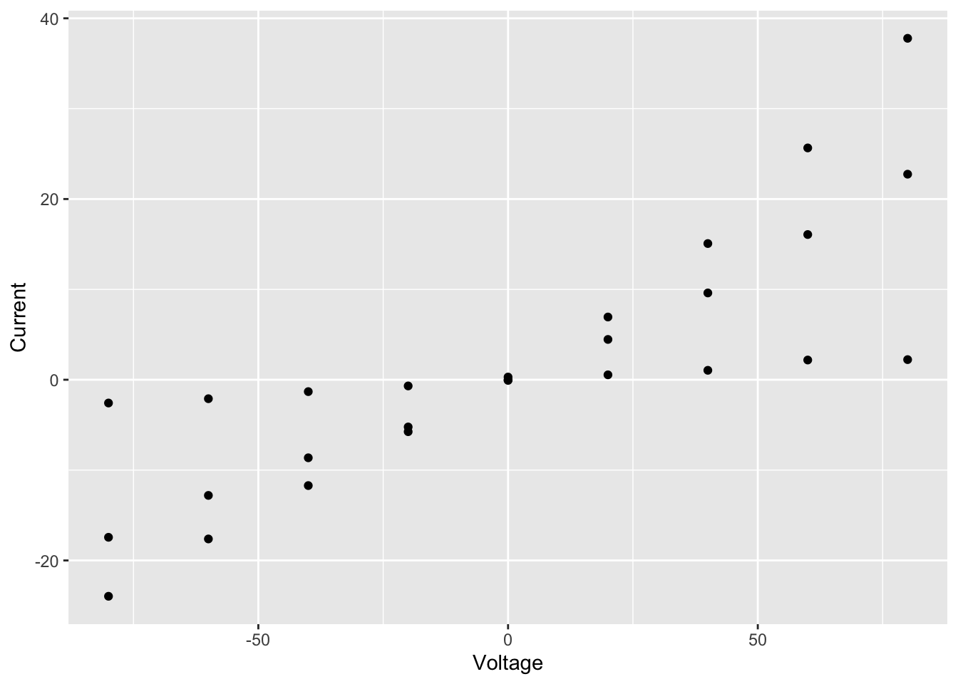
We specified 3 things to create this plot:
- The data – needs to be a data frame (or a tibble)
- The type of plot – this is called a geom in ggplot2 terminology
- The mapping of variables (columns in our table) to visual properties
of objects in the plot - these are called aesthetics in
ggplot2 and specified using the
aesargument
In this case, the type of plot is a
geom_point, ggplot2’s function for a
scatter plot, and the voltage and current density are mapped to the
x and y
coordinates.
Aesthetics
Look up the geom_point help page to see the list of
aesthetics that are available for this geom.
?geom_pointWe have 3 distinct groups and we can help to distinguish these in the plot by using another of the aesthetics: colour.
ggplot(data = summary, aes(x = Voltage, y = Current, colour = Group)) +
  geom_point()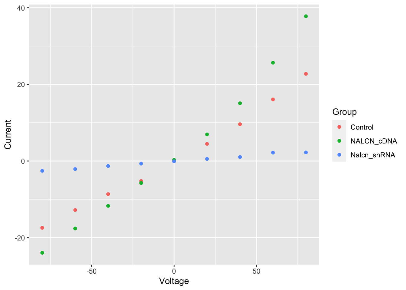
Line plot
Plots in ggplot2 are built up in layers. We’ll add another geom for connecting our points to create a line plot.
ggplot(data = summary, aes(x = Voltage, y = Current, colour = Group)) +
  geom_point() +
  geom_line()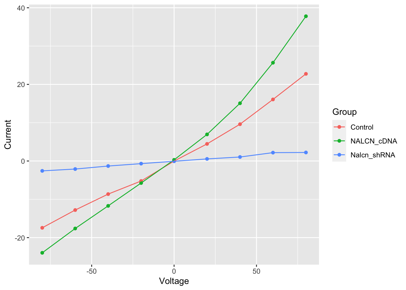
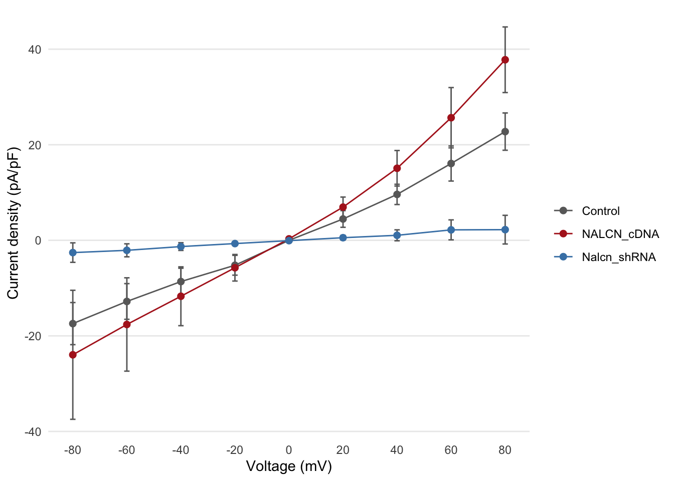
Error bars
This now looks a lot more like figure 2b in the Nature Genetics
paper, but in that figure error bars on each of the points are
displayed. We’ll add another layer to our plot using
geom_errorbar. This requires another two
aesthetic mappings for the lower and upper bounds representing the
uncertainty of each current density estimate.
ggplot(summary, aes(x = Voltage, y = Current, ymin = Current - SE, ymax = Current + SE, colour = Group)) +
  geom_point() +
  geom_line() +
  geom_errorbar(width = 2)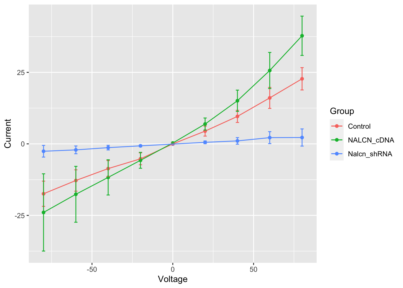
The other thing we did here was to adjust the width of the error bars as the default setting was not aesthetically pleasing.
Each of the geoms has specific options for changing its appearance. The help pages are a good place to start to learn about how each works and have lots of example code snippets that you can easily run to understand better how they work.
Customizing plots
You will almost certainly want to customize the appearance of your plots and ggplot2 provides lots of options to do so including the option of specifying a theme.
We’ll apply one of these themes, change the order in which the layers (geoms) are drawn, specify some colours and change the axis labels to make our plot look a bit more polished.
ggplot(summary, aes(x = Voltage, y = Current, ymin = Current - SE, ymax = Current + SE, colour = Group)) +
  geom_errorbar(width = 2, colour = "dimgrey") +
  geom_line() +
  geom_point(size = 2) +
  labs(x = "Voltage (mV)", y = "Current density (pA/pF)", colour = "") +
  scale_color_manual(values = c("dimgrey", "firebrick", "steelblue")) +
  scale_x_continuous(breaks = c(-80, -60, -40, -20, 0, 20, 40, 60, 80)) +
  scale_y_continuous(breaks = c(-40, -20, 0, 20, 40)) +
  theme_minimal() +
  theme(
    panel.grid.major.x = element_blank(),
    panel.grid.minor = element_blank()
  )
Statistical tests
The analysis of these data in the Nature Genetics paper also includes some statistical tests. For example, the authors tested for a statistically significant difference in the current response at a voltage step of +80mV between the NalcnshDNA and control groups.
We’ll first filter the values we need for this comparison.
test_data <- filter(current_responses, voltage == 80, group %in% c("Control", "Nalcn_shRNA"))Normally we’d visualize our data before applying a statistical test
to satisfy ourselves that the assumptions of the test hold. We’ll create
a box plot using another of the geoms available in ggplot2,
geom_boxplot.
ggplot(data = test_data, aes(x = group, y = current)) +
  geom_boxplot()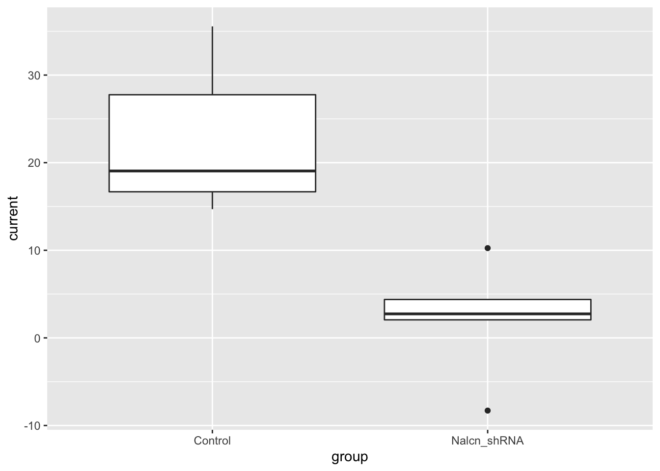
We only have 5 observations for each group in this case so the box
plot is perhaps not that useful for looking at the distribution of the
data. We’ll use geom_jitter to show the
points as well.
ggplot(data = test_data, aes(x = group, y = current)) +
  geom_boxplot(width = 0.4, outlier.shape = NA) +
  geom_jitter(width = 0.1, size = 2) +
  labs(x = "", y = "Current density (pA/pF)") +
  theme_minimal() +
  theme(panel.grid.major.x = element_blank())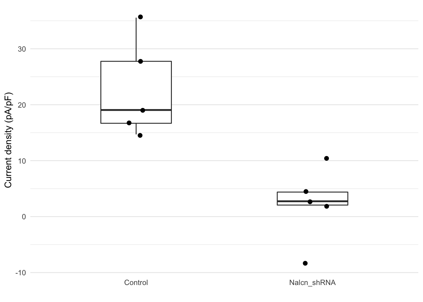
Finally we’ll run a non-parametric Wilcoxon test, also known as the Mann-Whitney U test.
wilcox.test(current ~ group, data = test_data)
    Wilcoxon rank sum exact test

data:  current by group
W = 25, p-value = 0.007937
alternative hypothesis: true location shift is not equal to 0