
September 2022
Single Cell RNAseq Analysis Workflow
Why do high-dimensional data pose a problem?
In single-cell data we typically have thousands of genes across thousands (or millions!) of cells.
- Interpretation/visualisation beyond 2D is hard.
- As we increase the number of dimensions, our data becomes more sparse.
- High computational burden for downstream analysis (such as cell clustering)
Solution: collapse the number of dimensions to a more manageable number, while preserving information.

There are many dimensionality reduction algorithms

Which genes should we use for downstream analysis?
Select genes which capture biologically-meaningful variation, while reducing the number of genes which only contribute to technical noise

- Model the gene-variance relationship across all genes to define a data-driven “technical variation threshold”
- Select highly variable genes (HVGs) for downstream analysis (e.g. PCA and clustering)
Principal Components Analysis (PCA)

It’s a linear algebraic method of dimensionality reduction
Finds principal components (PCs) of the data
- Directions where the data is most spread out (highest variance)
- PC1 explains most of the variance in the data, then PC2, PC3, etc.
- PCA is primarily a dimension reduction technique, but it is also useful for visualization
- A good separation of dissimilar objects is provided
- Preserves the global data structure
Principal Components Analysis (PCA)
When data is very highly-dimensional, we can select the most important PCs only, and use them for downstream analysis (e.g. clustering cells)
This reduces the dimensionality of the data from ~20,000 genes to maybe 20-50 PCs
Each PC represents a robust ‘metagene’ that combines information across a correlated gene set
Prior to PCA we scale the data so that genes have equal weight in downstream analysis and highly expressed genes don’t dominate
How many principal components for downstream analysis?
After PCA we are still left with as many dimensions in our data as we started
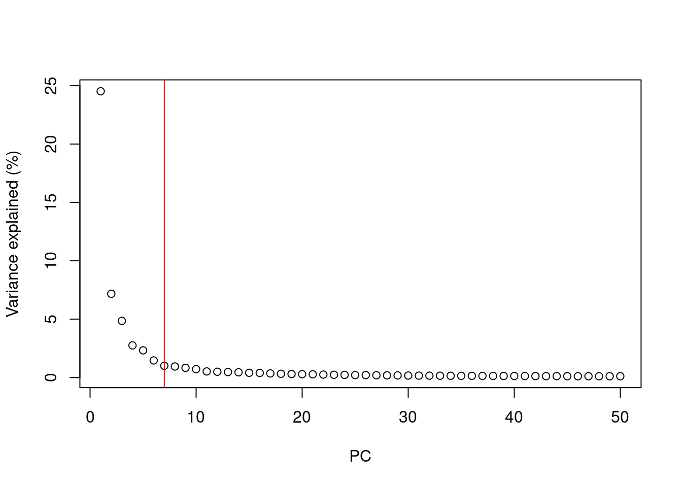
But our principal components progressively capture less variation in the data
How do we select the number of PCs to retain for downstream analysis?
- Using the “Elbow” method on the scree plot
- Using the model of technical noise (shown earlier)
- Trying downstream analysis with different number of PCs (10, 20, or even 50)
Visualizing PCA results: PC scores
Because PC1 and PC2 capture most of the variance of the data, it is common to visualise the data projected onto those two new dimensions.
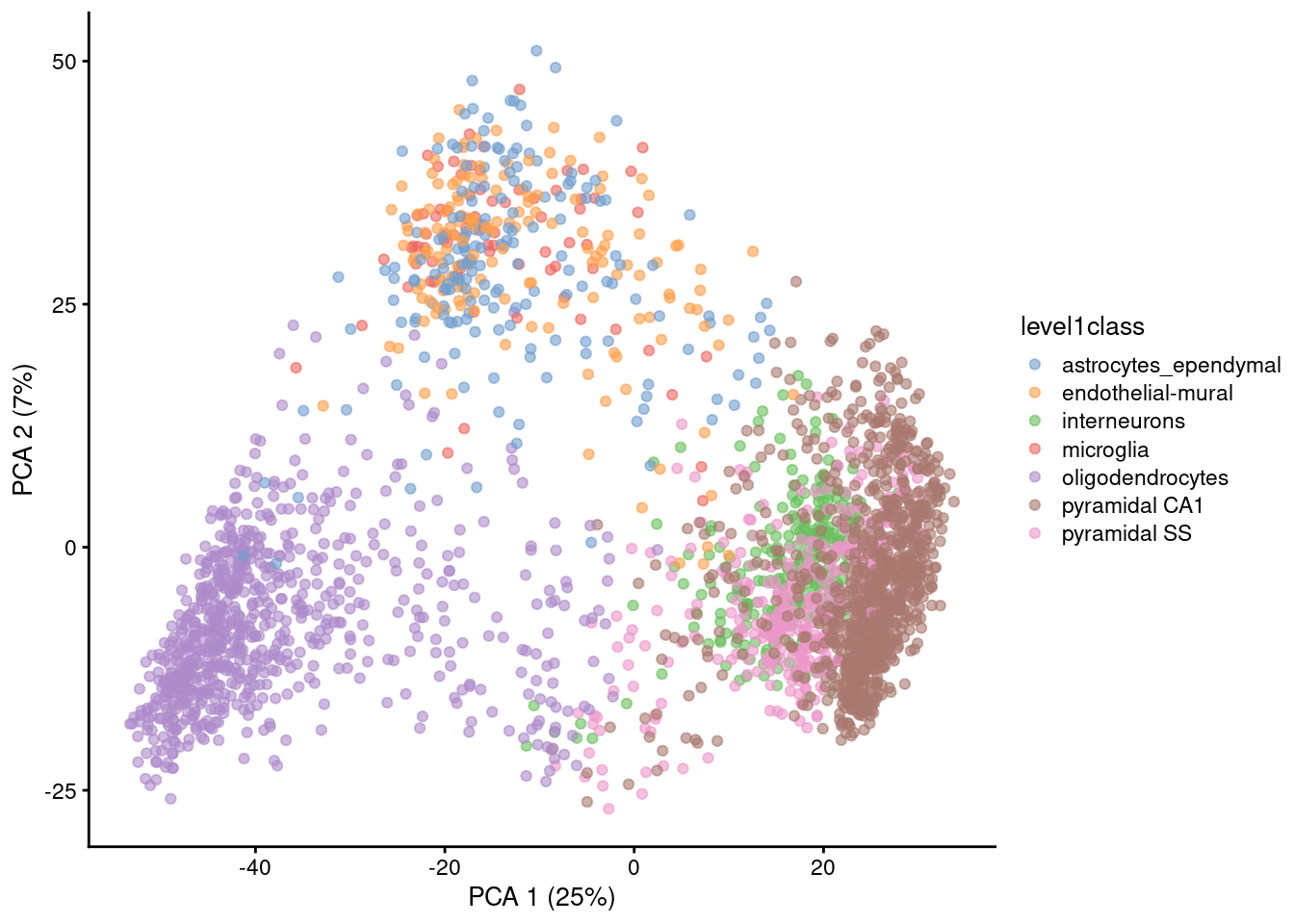
Gene expression patterns will be captured by PCs → PCA can separate cell types
Note that PCA can also capture other things, like sequencing depth or cell heterogeneity/complexity!
However, PC1 + PC2 are usually not enough to visualise all the diversity of cell types in single-cell data (usually we need to use PC3, PC4, etc…) → not so good for visualisation, so…
Non-linear dimensionality reduction methods

Graph-based, non-linear methods: UMAP and t-SNE
These methods can run on the output of the PCA, which speeds their computation and can make the results more robust to noise
t-SNE and UMAP should only be used for visualisation, not as input for downstream analysis
t-Distributed Stochastic Neighbor Embedding (t-SNE)

It has a stochastic step (results vary every time you run it)
Only local distances are preserved, while distances between groups are not always meaningful
Some parameters dramatically affect the resulting projection (in particular “perplexity”)
Learn more about how t-SNE works from this video: StatQuest: t-SNE, Clearly Explained
t-SNE
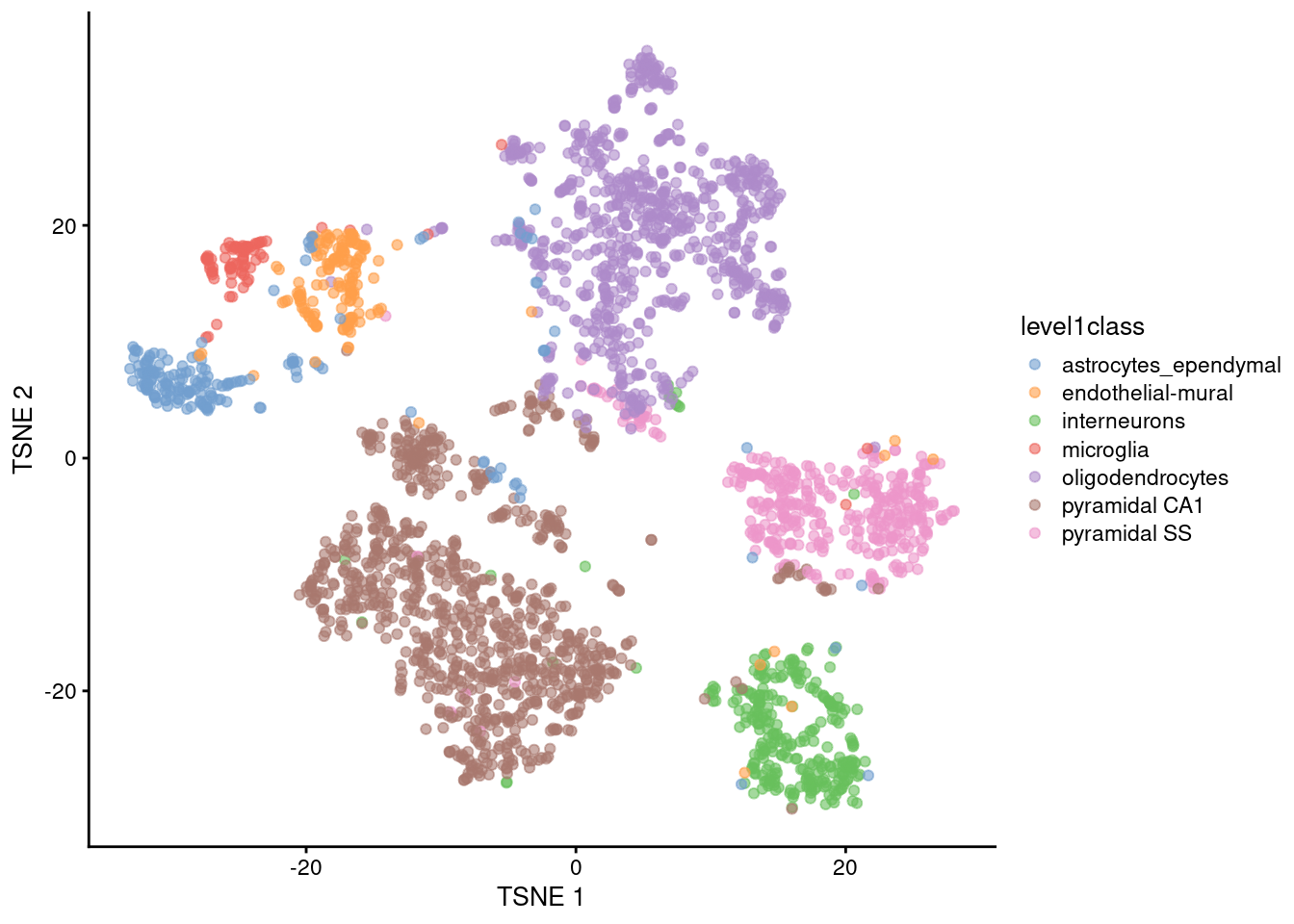
Main parameter in t-SNE is the perplexity (~ number of neighbours each point is “attracted” to)
- Balance between preserving local vs global structure
- Higher values usually result in more compact clusters
- But too high can lead to overlap of clusters, making them harder to distinguish
Exploring different perplexity values that best represent the biological diversity of cells is recommended.
UMAP

Non-linear graph-based dimension reduction method like t-SNE
Newer & efficient = fast
Runs on top of PCs
Based on topological structures in multidimensional space
Faster and less computationally intensive than tSNE
Preserves the global structure better than t-SNE
UMAP
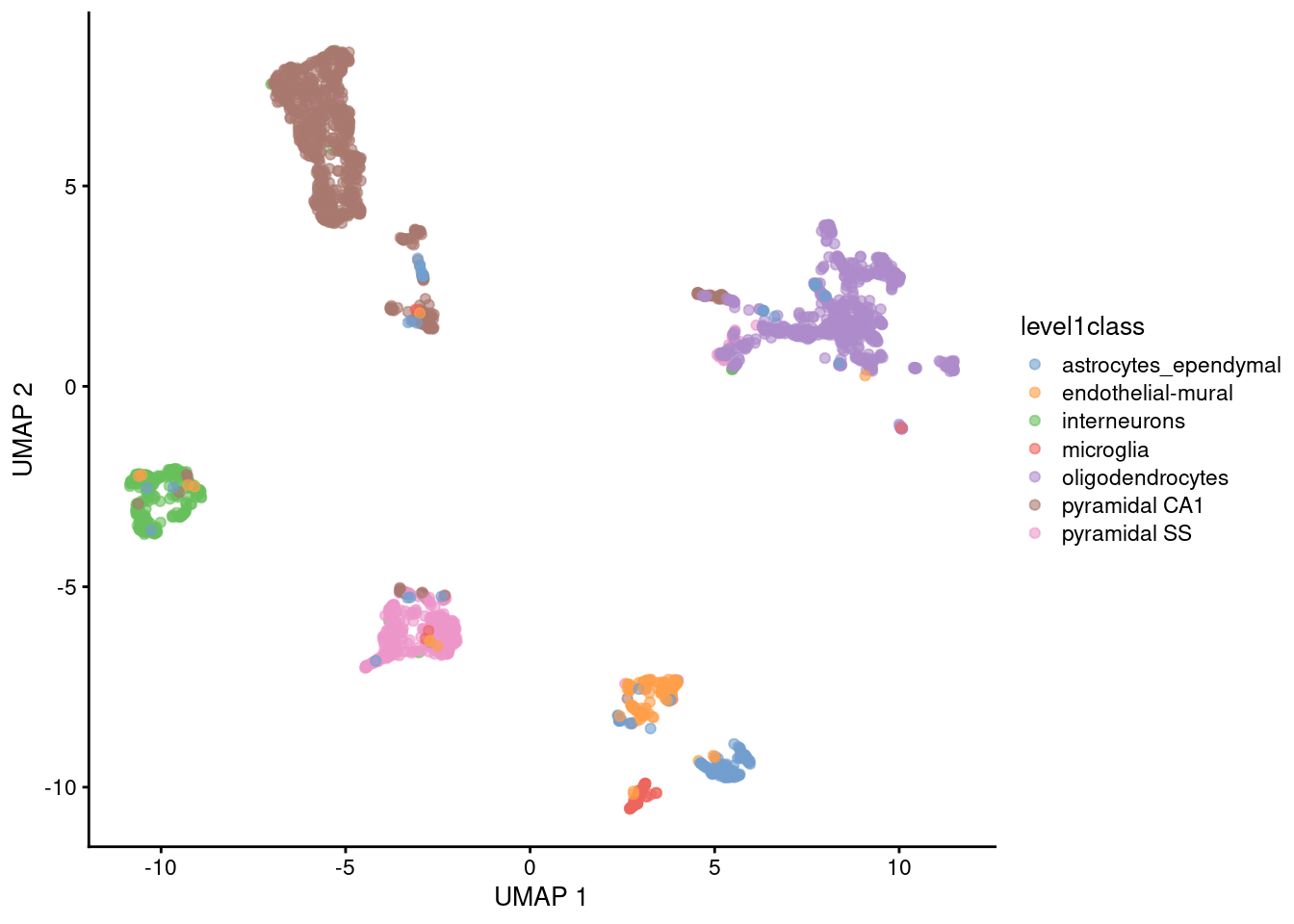
Main parameter in UMAP is n_neighbors (the number of neighbours used to construct the initial graph).
Another common parameter is min_dist (minimum distance between points)
- Together they determine balance between preserving local vs global structure
- For practical simplicity, we usually only tweak
n_neighbors, although playing with both parameters can be beneficial
Exploring different number of neighbours that best represent the biological diversity of cells is recommended.
Key Points
- Dimensionality reduction methods simplify high-dimensional data while preserving biological signal.
- Common methods in scRNA-seq analysis include PCA, t-SNE, and UMAP.
- PCA transforms the data linearly to capture the main variance and reduce the dimensionality from thousands of genes to a few principal components.
- PCA results can be utilized for downstream analysis like cell clustering and trajectory analysis, and as input for non-linear methods such as t-SNE and UMAP.
- t-SNE and UMAP are non-linear methods that group similar cells and separate dissimilar cell clusters.
- These non-linear methods are primarily for data visualization, not for downstream analysis.
Acknowledgments
Slides are adapted from Paulo Czarnewski and Zeynep Kalender-Atak
References (image sources):